Technology- Freshmen - Hull Public Feed
All About Christian
My slide shows a few things that I like. My favorite of different categories. This slide shows my favorite football player and basketball player. This shows that I like sports. It also shows the college that I want to go to. Since its all about me I found a picture with that bolded and put it in the center. The things that are all about me are all around it.
The first thing that I added to the slide were pictures of football stuff, since this is my favorite sport. Cam Newton is my favorite player in the N.F.L so I put a picture of him doing his signature Touch Down celebration. On the opposite side diagonal to that is a picture of his cleats. Also on this slide there is a picture of a football hemet.
In the future I want to go to the University of Oregon. So I put a picture of the Oregon logo. If I go to this college I would want to play football. This is why I have a picture of the Ducks mascot Puddles.
At first I thought the project was easy to make a slide. Then I found out that we had to explain the advertisement of the slide not the slide itself. It hard to explain why I did something a way if it was random. Now I learned from my mistakes.
Veronica Nocella- Media Fluency
At first, I thought creating a slide that easily depicts who I am would be easy. It shouldn't be too difficult just listing my interests and finding images to depict them, right? That was actually my first idea, though if I were to follow through with that, it wouldn't be visually captivating.
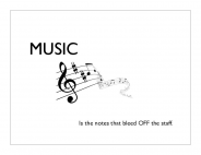
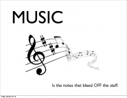
So, I decided to find one thing that I think represents who I am the most, which is music. Music has been very much apart of my life ever since I was a child, and it's something that will probably stay with me for the rest of my life. My father always played his guitar around me, and my uncle always took me to classical concerts.
I wrote the word "music" in a large font, in order to draw attention to it. I've also attempted the rule of thirds by adding a picture as well as a brief saying. I tried to create this slide in such a way so that you'd really only have to glance at it once to know the purpose of it. Not too much information; just enough to catch the eye. I've only stuck to a black and white color scheme.
Reflection:
The only changes I made visually to the slide is making the word "music" and the picture slightly larger to make up for the extra, unnecessary space. From creating this slide and watching my classmates present their slides, I've learned about the possible mistakes I could make, as well as the minor things that could make a slide more visually appealing.
Slide Presentation
Trying to make a slide visual can be difficult. You never know if it’s good enough. You try to fill in all the spaces and make sure it doesnt look empty by trying to make pictures bigger or put more pictures on there without making it look cramped together.
I chose to put a busy background so that the spaces in between wouldn’t look blank, empty and boring. I put pictures in my slide that describe what I live by. The first thing i did was put a picture of myself that would best fit the other pictures i would later add. When i was thinking of what to put in my slide, i started thinking of things i did in the morning and one thing was put on make up so thats where the Mac Collection comes in.
I tilted my pictures different ways to make it look more appealing so that people would want to know what they were about. I used repetition so that it would be clear of what i really liked. I clearly love Marilyn Monroe and beside the pictures, the quotes describe a what i look to for self motivation. I added ballet into my slide, it’s something that i have a strong passion for. It helps me escape the struggles and frustrations of everyday life. It’s peaceful and graceful and relaxing. I also incorporated a part of my culture into my slide which is where the Jamaican flag plays out.
My slides describes me in my simplest form and it goes with the good points i need to make a good slide.
My Home Network
My home network is set up with several laptops and a computer (mostly my dad's, as his job is immersed in technology), which connect to our wireless provider (wireless-ly). That has a cable going to our modem, which goes right to the cloud via our Comcast service. Our home phone, cellphones and tablets connect via AT&T straight to the cloud.
I learned from this that there are many connections required just to give an internet signal to a computer, which is something I never really thought about before. I also learned that the <...> symbol represents.
I would advise other people who are new to the internet to always remember: whatever you do on the internet has a permanent record. Whether it's browser history or something stupid you posted on Facebook, it will always be there and it is forever to stay.
Mikes Slide Presentation
My name is michael. This slide is made the way it is because ithis is my personality. Most of the things I do are based on what i know people will do. It also reflects my humor. i am verry “look, its nothing!” kind of person. this slide is who I am and thats why it looks the way it does.
Slide Presentation
Creating an interesting, but not overpowering slide is very difficult. When we first received this project I thought it would be very simple to create a dynamic slide about myself. Using what I learned in the two slide designing websites I attempted to create a simplistic slide about me.
My first idea was to have a photo of me in the center of the slide and have words around it. However, when I read the Presentation Zen website I saw that slides are meant to be visual aids, not text aids. Meaning that instead of having a bunch of words, people should only have to look at your slide for a moment to understand it. The explanation should happen when you are talking. For this reason I put 3 pictures and three words underneath them that explain me in a much faster way.
On the website Slide Design I read about contrasting colors. My slide color is blue. So I thought for a contrasting color I should use red, but a red that was dark enough not to be distracting from what the words actually say. For my pictures I decided to let the two on the ends “bleed off the page”. In Presentation Zen, it says that letting your picture bleed creates the illusion that the picture is bigger than it is. This was especially helpful because I couldn’t make my pictures bigger because they kept getting blurry.
Finally, I made my words at 80 and 68pt. font. I did this because in Slide Design it says that bigger font catches attention and forces you to use less words. I tried to create a simple slide that explained one point about me. It wasn't an easy thing to accomplish, but I think I did the best job I could. This project has taught me a lot and will help in future presentations.
Reflection
After listening to some of the critiques I decided to change a few things. I changed the pictures because my new pictures go better with my color scheme. I used red colors to contrast with the blue background. Then I framed the pictures and spread them apart to make the slide more interesting and more memorable. Then I made all the fonts bigger because that made them stand out more.
After listening to some of the critiques I decided to change a few things. I changed the pictures because my new pictures go better with my color scheme. I used red colors to contrast with the blue background. Then I framed the pictures and spread them apart to make the slide more interesting and more memorable. Then I made all the fonts bigger because that made them stand out more.
Rafi Hares Slide Presentation
Abuhena Hares
12/4/12
While presenting I learned that I need to be more formal with my speech. I must not say like or yeah as much. For my slide I also learned I should have a matching color scheme and make sure that the font are the same. The most important thing I learned is that positioning is key in advertising and that the order of words and pictures can change the flow and mood of the advertisement.
12/4/12
Working hard is something that is an everyday part of life. Its a basic cycle that I follow everyday. It can be abbreviated with the initials SWAG. Struggle, work hard, achieve, good job. These are very simple rules that I follow. I was once known as a procrastinator but owned up to my responsibilities to become a better person.
Struggling
is key in my life because it helps me learn. Whether its school work or
working at home. I always jump straight into my work so I can evaluate
it and try again in case that I fail. If I didn’t struggle in my work
then I wouldn’t learn anything from my mistakes. Working hard is the
basic essential of my life. Its putting basic effort into everything I
do. Putting in this basic effort shows that I take pride in my work and
attempt to make it attemptable. Achieving is the byproduct of my hard
work. Its when I get praise for helping around the house or writing an
analytic essay the praise helps me work harder in the future. The good
job part is my self reflection. I get to take a step back and understand
how I did on my work and what I can do in the future. This is an
infinite cycle that will be repeated forever and beyond time itself.
While presenting I learned that I need to be more formal with my speech. I must not say like or yeah as much. For my slide I also learned I should have a matching color scheme and make sure that the font are the same. The most important thing I learned is that positioning is key in advertising and that the order of words and pictures can change the flow and mood of the advertisement.
All About Me: Christian Moore
My slide shows a few things that I like. My favorite of different categories. This slide shows my favorite football player and basketball player. This shows that I like sports. It also shows the college that I want to go to. Since its all about me I found a picture with that bolded and put it in the center. The things that are all about me are all around it.
The first thing that I added to the slide were pictures of football stuff, since this is my favorite sport. Cam Newton is my favorite player in the N.F.L so I put a picture of him doing his signature Touch Down celebration. On the opposite side diagonal to that is a picture of his cleats. Also on this slide there is a picture of a football hemet.
In the future I want to go to the University of Oregon. So I put a picture of the Oregon logo. If I go to this college I would want to play football. This is why I have a picture of the Ducks mascot Puddles.
Adowa Mohamed: Media Fluency
My goal for this slide is to make it easy to understand and appealing to the eye. I made one of my pictures bleed and overlap to make it personal. I learned about these techniques from the Presentation Zen website. Another thing I added to my slide were facts and little details about my self. I believe this slide is interesting and will grasp the attention of the reader.
I chose images that meant something to me personally. I also only chose three pictures and balanced them out diagonally across the slide.This made the slide more appealing to the eyes. I chose the Canadian Flag to because I love Canada and I also have a picture of the hunger games trilogy. The hunger games is one of my favorite trilogy. Then I have a picture of the three top colleges that I would love to attend. Also to end off my slide I added one of my favorite quotes by Malcolm X. The quote has a really good meaning to it and tell students and kids that the only way to succeed in life is to be educated.Also for my slide I left some negative space so it would not look confusing and cluttered.
I am very pleased with the fact that I now know how to make a slide look interesting and will apply this to future assignments. These techniques are also used in advertisements.
Reflection:
For my new slide I focused more on one topic which is Canada and then I focused on one color. This slide is better then the previous one because the other one had to many pictures that had nothing to do with each other. Then I also focused on the topic "Canada" and made the background of my slide the Canadian flag. This slide was nice and simple and to the point. I really feel confident that this slide is more appealing to the eyes of the reader.
For my new slide I focused more on one topic which is Canada and then I focused on one color. This slide is better then the previous one because the other one had to many pictures that had nothing to do with each other. Then I also focused on the topic "Canada" and made the background of my slide the Canadian flag. This slide was nice and simple and to the point. I really feel confident that this slide is more appealing to the eyes of the reader.
Slide Design by Bella Mezzaroba
“Always think big”, describes me perfectly. I don’t do anything small. I’m determined to succeed in everything I do and like to make things extravagant. I tried to make the slide design as appealing as possible.
I was very tempted to make this slide fancier and more detailed but less is more in this situation. The simple picture of the earth bleeds of the page giving the illusion of a larger image and the font emphasizes the importance of this slide. I used colors that flowed well together and kept the eyes of my audience focused. I also attempted to use the Rule of Thirds, and evenly distributed the words and pictures across the slide.
I was very tempted to make this slide fancier and more detailed but less is more in this situation. The simple picture of the earth bleeds of the page giving the illusion of a larger image and the font emphasizes the importance of this slide. I used colors that flowed well together and kept the eyes of my audience focused. I also attempted to use the Rule of Thirds, and evenly distributed the words and pictures across the slide.
From this project, I learned that visual design is an art. There are rules and regulations that you must follow for your design to be visually pleasing. I used the rule of thirds and page bleeding in my second slide.