• Log In
  • Log In
Science Leadership Academy @ Center City
Science Leadership Academy @ Center City Learn · Create · Lead
  • Students
    • Mission and Vision
  • Parents
  • Community
    • Mission and Vision
  • Calendar

Art - Freshman · Hull · d1 Band Public Feed

Create a Post

Final Stamp Design

Posted by Kyla Gladney-Enos in Art - Freshman · Hull · d1 Band on Friday, May 12, 2017 at 5:22 pm

IMG_7607.JPG This speech bubble represents me because I tend to have a lot to say. I usually don’t say what I want to say, so that’s why the dots are there. The assignment said to write down 10 words that best describes who we are. We then had to pick 3 of the 10 words that best describes who we are. My 3 words were unique, intelligent, and creative. This stamp represents me because when I give my opinion on things, it tends to open people’s minds in a different way. I came upon this design because a classmate said it suits me due to my abilities to entertain people. I however thought this design suits me because of my creative ideas.

Negative and positive space is important because without it, we wouldn’t be able to see things clearly. They help us focus on what the main idea of a picture is. I used positive space in my design by outlining the speech bubble and the 3 little dots. To truly understand the process of negative and positive space, you have to know what the main subject in a picture is. The main subject is the positive space, and the rest is the negative space. I rarely got stuck on anything while completing this assignment. I had trouble cutting my original drawing of the speech bubble, but other than that, there wasn’t any difficult parts. I learned that positive space is usually the space that is the lightest or darkest in a picture.
Be the first to comment.

Final Stamp Design

Posted by Kai Payton in Art - Freshman · Hull · d1 Band on Friday, May 12, 2017 at 5:14 pm

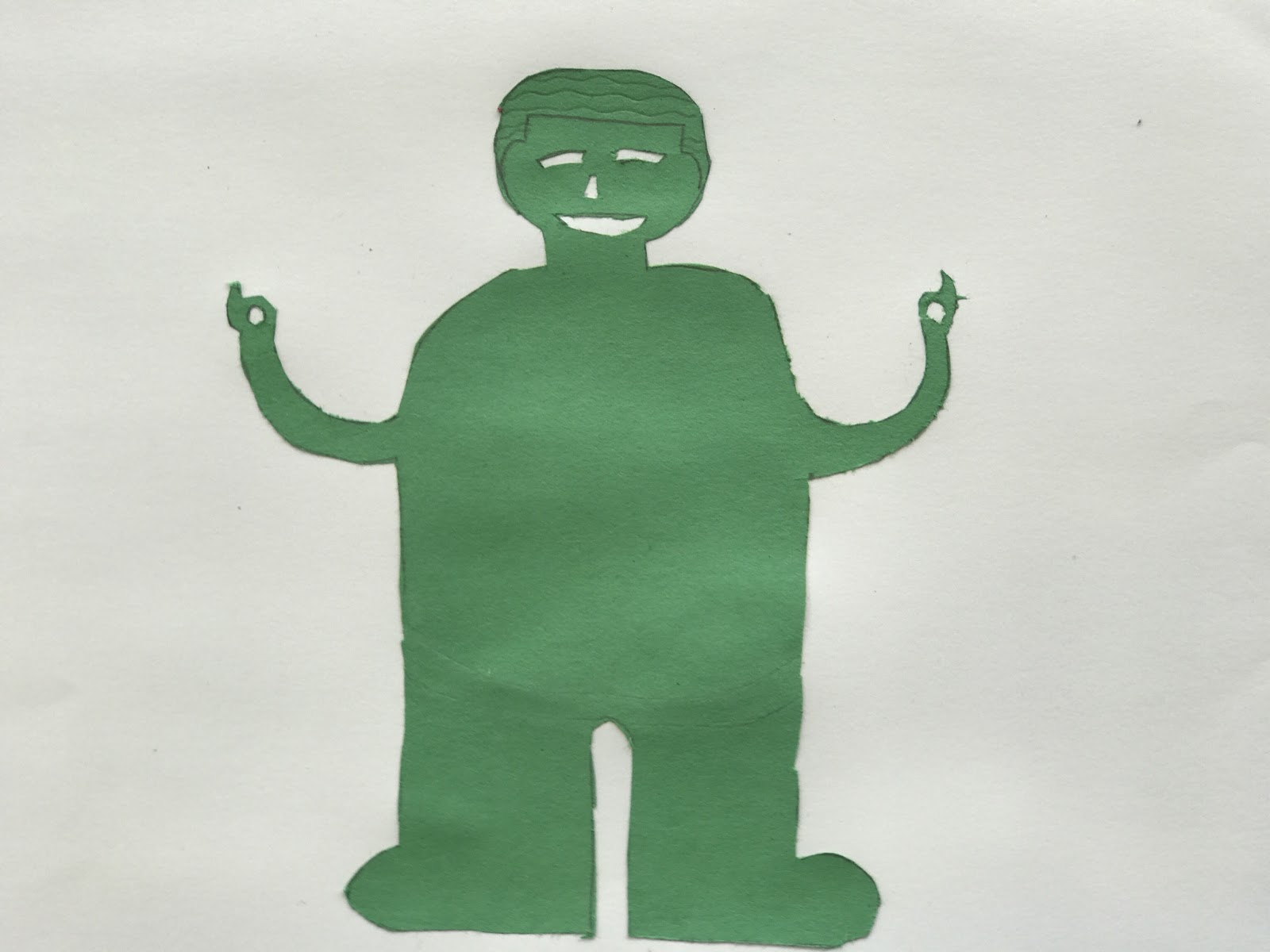
For this assignment I had to create a stamp the represented me. The previous assignment helped guide us to make our “stamps.” We made our design on a separate piece of paper.  We then shaded the other side of the paper so we could get the design of the stamp on construction paper. We cut out our designs to show the negative and positive space. My final product is above.

The green is my negative space and the white is my positive space. The eyes shouldn’t be cut out. I found the negative space by thinking if a light was behind it what would the light go through. If there wasn’t negative and positive space my guy wouldn’t be shown in the picture.

When we first learned about negative space it was really confusing. Then over time I started to understand it more and more. I got stuck when doing this assignment because I had a belt but due to the negative and positive space it wouldn’t show. Another thing that wouldn’t show would be the eyes but I didn’t realize that until I cut them out. I also had to change lines into shapes so that they could show on the final product.


Be the first to comment.

DIVERGENT (Final Stamp Drawling)

Posted by Orlando Irizarry in Art - Freshman · Hull · d1 Band on Thursday, May 11, 2017 at 8:14 pm

IMG_6771
IMG_6771
My stamp stands for "Divergent" because I see my self as a different human being. The word Divergent represents me perfectly because I express, learn, and is a different person in general whether its academically or not. Some words that I brainstormed was Straight forward, Outspoken, and Thoughtful but Divergent stood out the most. To create my image it took two periods because I either got frustrated or couldn't cut my stamp out. But I think my work paid. off because I love my stamp, and got a comment by Ms.Hull that my stamp describes me very well. As you see on my stamp the positive parts are my arrows because, it shows to me that I am able to become successful and many different ways and my personality can be either down a positive route or a negative route. The hardest part for me was to chose my positive and negative space because I didn't know which part will look better cut out, so I gave it a try and went to cut out my arrows and it worked!
Be the first to comment.

Creative Print

Posted by Shyann Davis in Art - Freshman · Hull · d1 Band on Thursday, May 11, 2017 at 7:08 pm

          ​This stamp symbolizes me because I love making things and being very creative. The letters are weird and you wouldn't really see anyone write like that, that's why I like this. In my brainstorming I wrote weird, funny, self conscious, social, but my favorite was creative. I knew what I was going to do with that right away. I looked up different ways to look up some of the letter and the silliest ones I found I put on my print. 
          The negative space in my picture are the letters and its important so that the positive space, the background, won't clash and you can't tell the difference between the two. To truly understand the process of negative and positive space is just to practice. Making sure what you want to see is seen.I got stuck on the connected letter E. It still came out how I wanted it but I had to do about three tries. I was rushing so then I knew I had to slow down to get the perfect E. I learned that your picture can go in and out of negative and positive space as long as you can still see your picture.
Printmaking
Printmaking
Be the first to comment.

Final Stamp Design

Posted by Payton McQuilkin in Art - Freshman · Hull · d1 Band on Thursday, May 11, 2017 at 10:21 am

IMG_1238.JPG


In this process I struggled. I had a hard time understanding what to cut and what to glue. In the end product I guess I can say I finish better than I thought I would. This stamp represents me because I would describe myself as a skinny, imperfect, and delicate person. When brainstorming I used words such as; unique, imperfect, pretty, intelligent, etc.

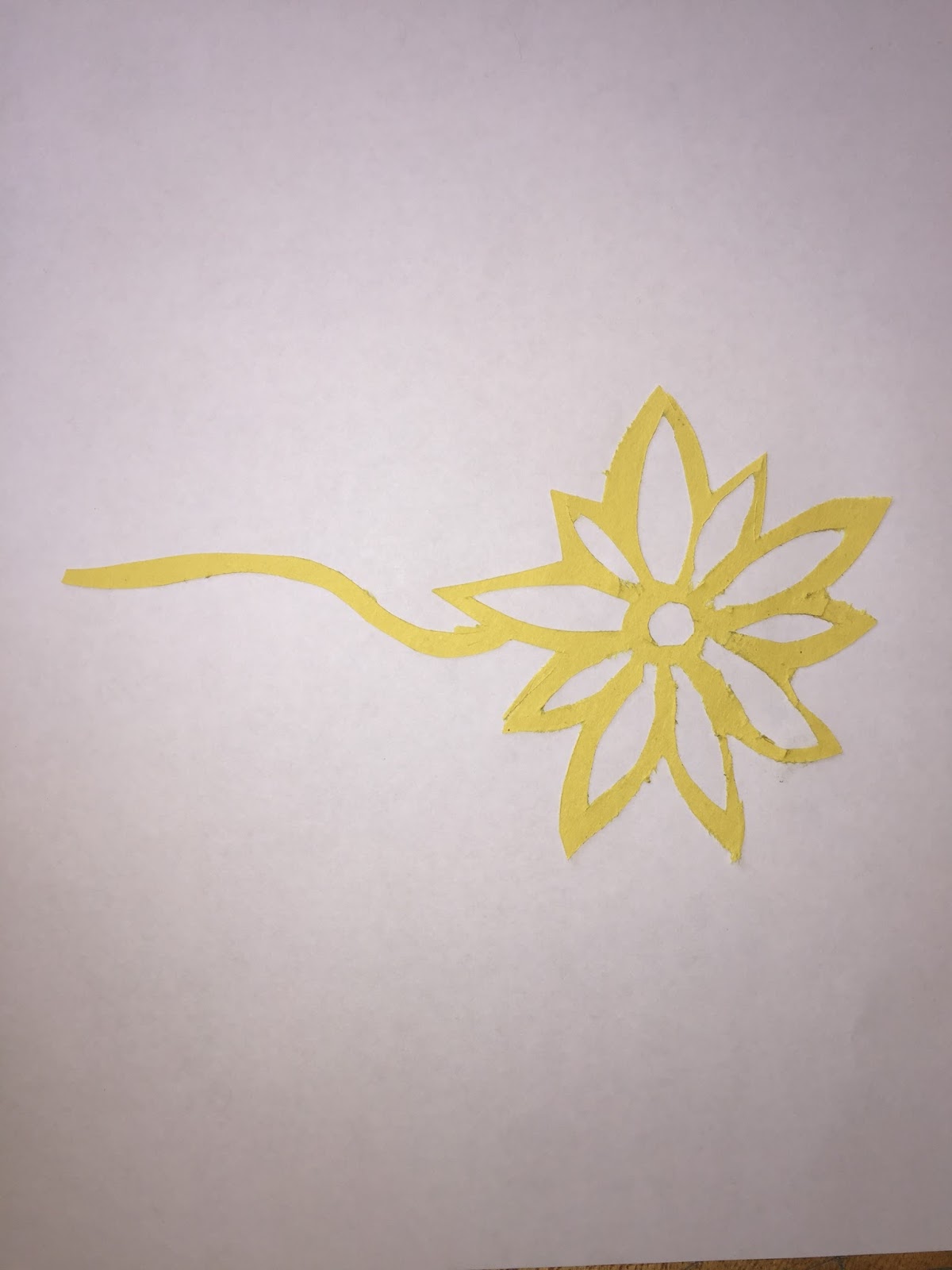
Throughout this assignment I learned what the background and steps of the stamp. At first we practice with cutting out a design already made. I did it wrong at first so I had to do it again, until I finally finished successfully. I finally understood that the negative and positive space we had in each picture. We made our very own designs.We learned they couldn’t just have lines, everything had to be shapes. I figured finally how to cut out my imperfect flower and it turned out pretty good.  
Be the first to comment.

Final Stamp Design

Posted by Asnain Khan in Art - Freshman · Hull · d1 Band on Thursday, May 11, 2017 at 10:03 am


Hello! My name is Asnain Khan and I did this project for my Art class. For this project, we had to brainstorm 10 words that represent us, pick three words and make them into a visual representation of us. Then, we sketched out our stamp and created a 7x7” rubber stamp in our sketchbooks the with correct negative and positive space. After that, we took our final rubber stamp design and cut it out of a single piece of construction paper. Which we then took the positive space of the rubber stamp design cut out and glued it into our sketchbooks.

When I was brainstorming, I used words such as, thoughtful, honest, hard worker, reliable, responsible, talented, successful, supportive, supportive, passionate, and open-minded. I chose the word honest. My stamp is a logo that represents honesty. This logo represents how honest I am. As you can see, this logo is in positive space. Positive space refers to the main focus of a picture. Negative space refers to the background of the picture. To end up with positive space, I cut out the negative space. Everything that is black is the positive space of my picture.

When I was sketching my design, I had a couple of problems. First, I didn’t know what to draw that represent honesty. Then, I thought about doing this. I had a problem figuring out how I can get positive space. But I figured out how after a while. This is how I got my logo.

I learned a lot about positive and negative space. I learned that positive and negative space play an important role in determining the overall composition in a work of art. I also learned that, positive space is best described as the areas in a work of art that are the subjects, or areas of interest and negative space is area around the subjects, or areas of interest. I enjoyed creating both positive and negative space.


Be the first to comment.

My Stamp

Posted by Sara Frunzi in Art - Freshman · Hull · d1 Band on Thursday, May 11, 2017 at 9:59 am

In this stamp, I made a personal logo of a coffee cup, cutting out the negative space to outline the positive space. First, let me explain what positive and negative space are. Positive space is any space in a picture where there is something, it's your subject. Negative space is the opposite, the space where there is nothing. It outlines the positive space, the way it forms my coffee cup. 

This project was done over the course of a few days. The first day, I was told to come up with a list of words to describe me, then to research and brainstorm image ideas for this stamp. This stamp represents me as a coffee-lover. I think that coffee seems to represent me, because some people like me and others don't, but the ones who like me appreciate me a lot. It also represents me as a barista, a job that I love. 

After brainstorming, I sketched my design. My first idea was too small at first, so I had to blow it up a bit. That's how I came up with this idea. I made my coffee cup bigger and added some steam coming off of it. Then, I cut out the negative space of my design on construction paper using an exacto knife. Finally, I glued my negative space onto a piece of pink construction paper and glued the whole thing into my sketchbook.
Be the first to comment.

MP1 Art Blog and Artist Statement

Posted by Diamond Wallace in Art - Freshman · Hull · d1 Band on Monday, May 8, 2017 at 9:26 pm

Printmaking is the process of making artworks by printing, normally on paper. The technique of duplicating images goes back several thousand years to the Sumerians who engraved designs and cuneiform inscriptions on cylinder seals. Printmaking originated in China after paper was invented around AD 105. Relief printing appeared in Europe in the 15th Century, when the process of papermaking was imported from the East. Daniel Hopfer decorated armor in this way, and applied the method to printmaking. Etching soon came to challenge engraving as the most popular printmaking medium.

bird.jpg


I noticed how the bird has many simple details.There are different shades of blue on the bird feathers. The background is contrasting from the bird. The bird fills up the page and is very eye catching.
Be the first to comment.

The Art of Printmaking

Posted by Sierra Radford in Art - Freshman · Hull · d1 Band on Monday, May 1, 2017 at 10:42 pm

Printmaking is a type of art that is made by printing, most commonly made on paper. This process was created 105 AD and originated in China. Printmaking is made by drawing out a design, carving out the negative space with a carving tool, applying ink to the drawing then lastly transfer ink to a piece of paper. There are different form of printmaking but the main four that contrast with relief printing are called intaglio, lithography, serigraphy, and mono-printing. When you cut an image into metal it is called intaglio. Lithography is based on repelling chemicals of water or oil. Monoprint is one version that cannot be copied. Serigraphy is a silk screen printing that was invented in the 20th century. Serigraphy was invented in America. Printmaking also made an appearance in Europe in the 15th century. Printmaking is revolutionary. It adopts different techniques from different countries and they all make different looks. For example Chinese printmaking are usually black and white and focuses more on gradients and American printmaking is more colorful and shadow is often applied. Printmaking is important because the various processes that are a part of making a print is through printmaking.


https://www.britannica.com/art/printmaking/History-of-printmaking

This piece of artwork is artistically interesting because I notice the picture is black and grey print with pops of brown. I wonder why the artist chose these colors and how the mood or the emotion shown will change by using colorful colors. What if the two men wasn’t in the background wasn’t in this print, how will it change the picture’s meaning. What if there was a gunman in the picture, how would that change the meaning.  


Be the first to comment.

I tried/ Negative, Positive Reflection

Posted by Orlando Irizarry in Art - Freshman · Hull · d1 Band on Thursday, April 27, 2017 at 6:01 pm

IMG_0875
IMG_0875
So today I will explain what is negative space. Negative space is mostly what brings out the subject in your picture. Its when you use a dark color around a light cat so it will stand out. For my house collage I chose the outside of the house to be the negative space because when I glue it together it will fit great. But sadly for my collage I messed up but learned a lesson which is to think your process. I chose the outside because you can get the outline of the house. I chose to cut the outline because it will bring any artist to the center which in my case a half of the house. It also enhances my drawling because you can notice all my mistakes sadly because I didn't match it up together but if I did you will see my image clearly. 

                                                        Sorry for the image I tried
Be the first to comment.
73 posts:
← Prev
  1. 1
  2. 2
  3. 3
  4. 4
  5. 5
  6. 6
  7. 7
  8. 8
Next →
RSS

ART9-023

Term
2016-17: 2nd Semester

Other Websites

Launch Canvas

Teacher

  • Marcie Hull
    Science Leadership Academy @ Center City · Location: 1482 Green St · Shipping: 550 N. Broad St Suite 202 · Philadelphia, PA 19130 · (215) 400-7830 (phone)
    ×

    Log In